SSRS Tutorial
Introduction to SSRS
Microsoft SQL Server Reporting Services (SSRS) helps enterprises and organizations easily generate, manage, and distribute reports with minimal fuss.
Utilising an interactive visual report-creating approach, this solution offers users a way to transform raw data into actionable insights that provide tangible value to business decisions.
Users of SSRS are able to easily create understandable reports using this application, connecting various data sources – databases included.
They may then view or print these online reports that can come in various forms including maps, tables and charts for ease of presentation.
Basics for SSRS
Visualization Tool
Visualization can be an extremely helpful method of comprehending and interpreting data.
By offering a straightforward presentation of complex material, visualization helps users make educated decisions while further developing their understanding.
By visualizing data in different forms – such as line charts or bar graphs – users can gain a comprehensive understanding of it all, making informed decisions regarding performance.
Visualization helps individuals see which quarter has performed better while others may have experienced decline.
Visualization allows users to focus on areas needing improvement and prioritize them during work activities.
Visualization provides individuals with a tool for more easily making informed decisions and understanding data sets more clearly.
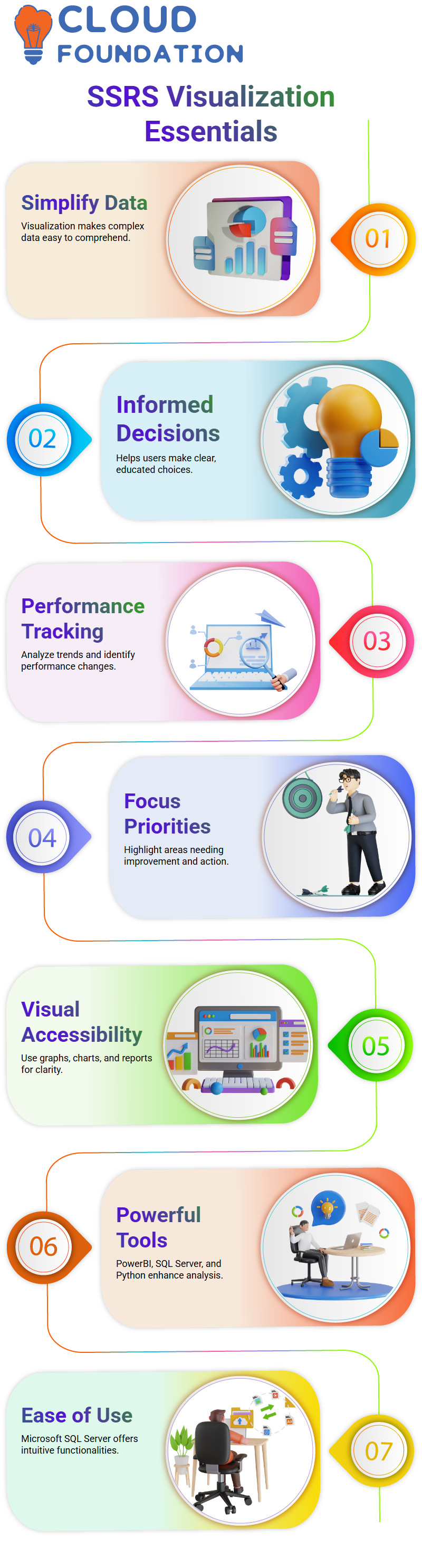
Visualization in data analysis: Visual representations can provide users with easy and effortless access to their data, making it simpler for them to comprehend and process it.
They come in the form of graphs, reports and charts which often serve as representational tools with their simplicity yet power.
Current market offerings of visualization tools like Power BI, SQL Server and Python serve multiple functions; including analytics, visualization and reporting.
However, Microsoft SQL Server stands out due to its user-friendly development environment that facilitates an easy understanding of its platform.
Microsoft SQL Server
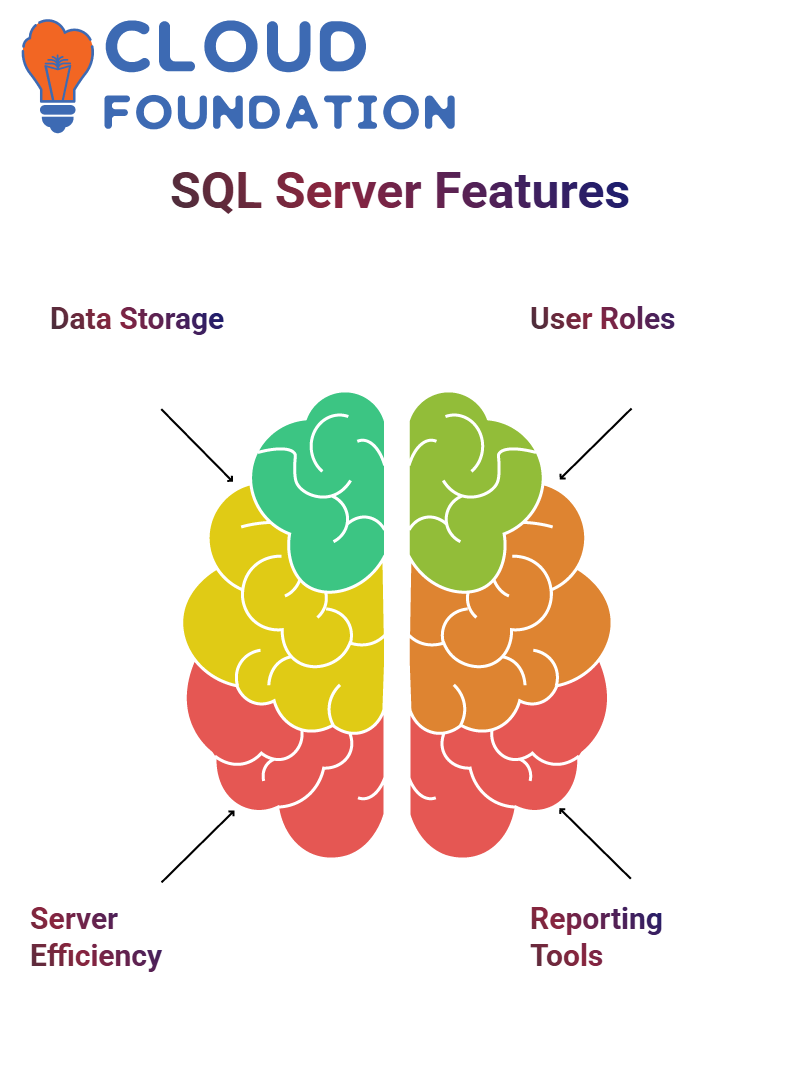
Microsoft SQL Server provides users with an effective means to store and remotely access data to create reports according to their unique specifications.
Company concentrates its efforts on server performance, security and processing; developing tools and technologies accordingly.
The SSRS architecture features three user types – report users, designers and managers.
Report users are those who utilize data and require access. Furthermore, they require insights into its potential utility.
Microsoft SQL Server includes two initial tools – SSIS and SSAS – which allow users to both generate reports on their data as well as effectively manage it.
These programs must enable effective report writing without losing control over it all.
SSRS serves as a central repository and processing hub, making data management simpler for its users. Users can access and manage their information efficiently with this resource.
Report development encompasses multiple steps, from using SSRS and working with report designers, designing reports based on existing data sets, and finally providing them to your desired target audience.
Report managers are accountable for overseeing all stages of report production and distribution processes, which include making sure reports, meet audience accessibility needs while meeting their requirements.
Data sources include SQL Server, Oracle or any other databases. Once linked with one another they can be used to extract information and retrieve and render.
Filtering data, analyzing it and satisfying requirements are core functions.
Report-making includes creating reports, publishing them to readers or editing existing ones to meet changing conditions or make needed modifications.
Publishing reports is completed using the web browser, where they are processed through a web service interface for easier viewing and interaction with reports by all.
At the core of report processing lies an XML web service interface used when publishing reports to be sent directly to web browsers for viewing by intended audiences.
With its easy accessibility and wide reach, these reports ensure they reach their audiences effectively and successfully.

SSRS Training
Components of Microsoft SQL Server
Microsoft SQL Server comprises three major components. First is its server component, comprising three tools – including integration services that combine data from disparate sources into one cohesive whole; sources, such as Microsoft SQL Server itself; and resources.
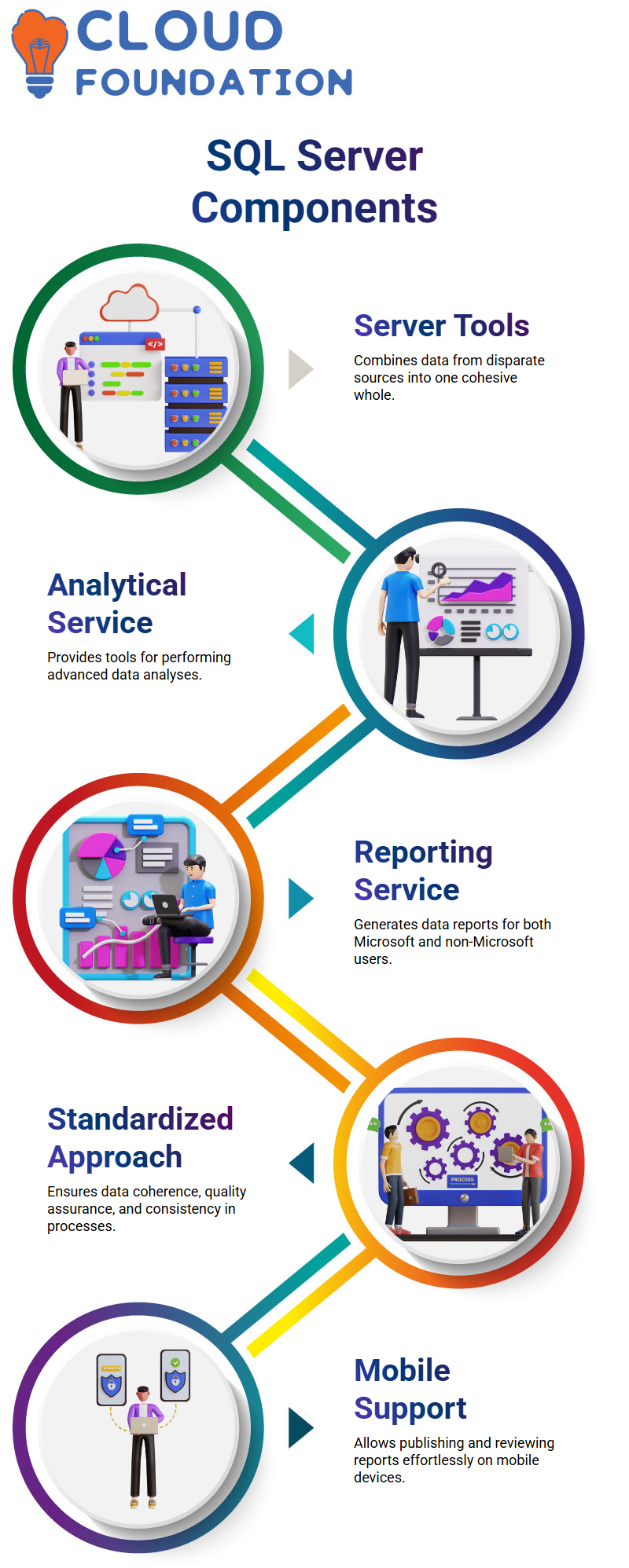
The analytical service provides tools that assist users in performing data analyses. Within Microsoft SQL Server is also the reporting service which users can utilize to report on their own data – this service can be utilized both by Microsoft users as well as non-Microsoft ones.
Microsoft SQL Server provides advanced data analysis capabilities.
Microsoft SQL Server’s comprehensive product line-up ensures quality assurance, data standardization and overall process consistency across different tools used.
This standardized approach guarantees data from each of them will appear coherently within any process environment.
Working on SQL Server provides users with a standardized process when it comes to reporting services; users already use similar data across services; thus assuring quality checks are met before use of data is recommended for consumption.
Mobile support is another significant element of this product line, making it simple and effortless for users to publish and review reports on mobile devices.
As soon as a report is published, it appears on user browsers and mobile applications for viewing purposes – anyone wanting to view can do so simply by having its URL handy.
Likewise for publishing new reports – any interested reader only requires accessing it once it has been posted online!
Mobile support can be especially valuable to users looking to view reports from any device via an URL they provide; thus making the report easily accessible across all mobile platforms.
Microsoft Power BI
Microsoft Power BI is an advanced tool that makes creating and sharing reports simple for anyone to access.
This feature can be extremely helpful to users who require to present specific reports to clients in the US. A report can be prepared using data supplied by users, then published and shared with clients after being complete.
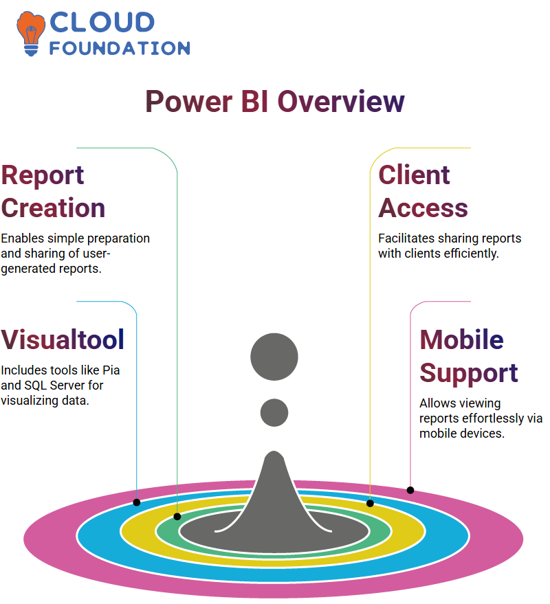
Microsoft Power BI provides users with various visualization tools, including Pia and SQL Server reports. When downloading this app on their phones, users have access to these visualization tools allowing them to easily view SQL Server reports as well. This feature has proven an immense asset for Microsoft.
PowerBI is an exceptional data visualization solution, helping users visualize data in various forms – including Excel – while offering vibrant visualization features necessary for businesses to effectively manage their information.
However, PowerBI should not be seen as an equivalent replacement to Microsoft SQL Server, which provides comprehensive business intelligence features including data processing, integration and visualization all from one package.
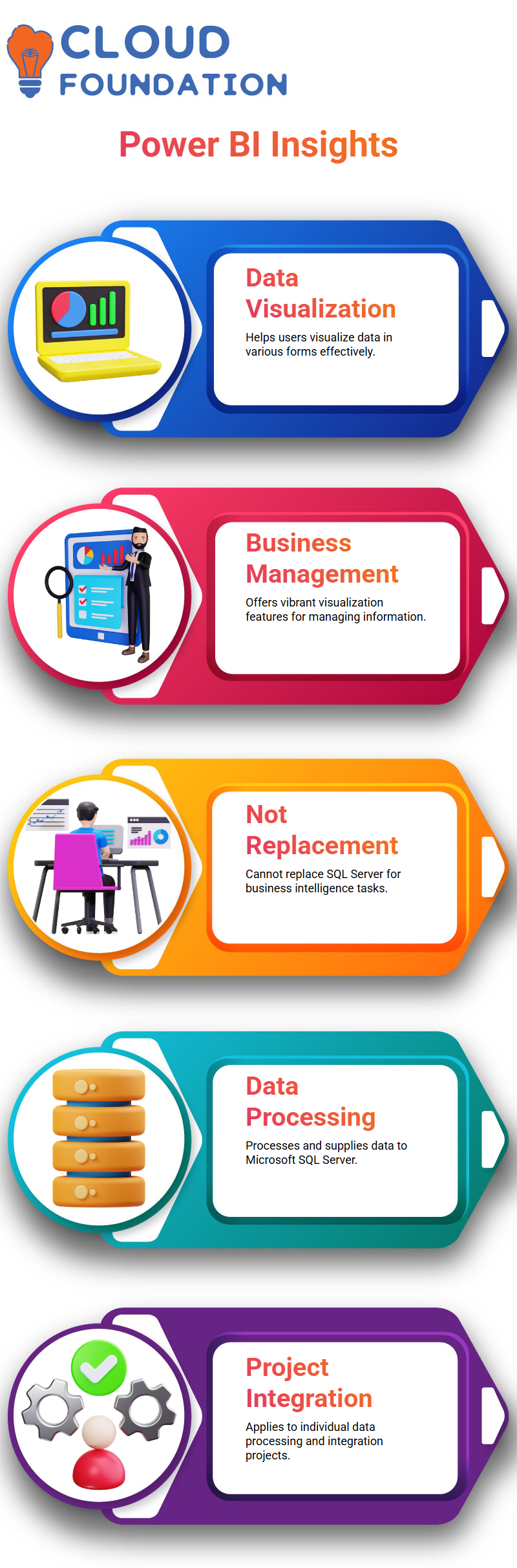
SQL Server can be invaluable when working with Microsoft SQL Server; it also has applications in individual data processing and integration projects.
PowerBI is intended for processing and providing data to Microsoft SQL Server; however, it should not be used individually or for business intelligence solutions purposes.
Data Charts
Data charts are an efficient means for representing horizontal data sets based on specific values.
Used extensively across many industries and product lines, data charts allow viewers to analyze proportions or analyze products within particular groups or classes.
A line chart represents multiple points connected together by connecting lines or dots – providing another popular data visualization method.
Used for measuring data over an extended period, such as sales over time or the number of employees over a fixed timeframe, data charts allow one to quantify data such as sales figures or employee counts over specific intervals of time.
They allow one to analyze either their sales over a set time frame or employees over fixed timespan.
Sub reports are another type of data chart used for evaluating information over time.
An interesting sub report that can provide valuable insight into different product categories is called an analytical sub report.
These reports tend to stand alone and may offer unique analysis that offers greater perspective of their performance.

SSRS Online Training
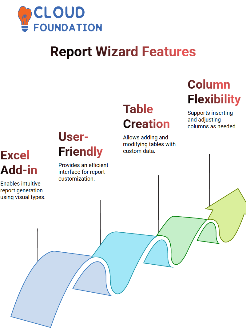
Report Wizard
Report Wizard is an Excel add-in which enables users to easily and intuitively generate reports using various visual types (reports, data sets). Users are provided a user-friendly interface which enables them to use this tool efficiently for report creation and customization.
How to create reports in SSRS
In order to create reports using SSRS, users need to specify their data source, choose between options like report wizard report data source and data set and click “Add.”
This will create a new report workspace in which visual elements can be added as desired.
Users who would like to create a new table should right-click and choose “Insert”, this will generate a table with their chosen data type and allow users to add data such as customer IDs, names, cities and countries directly onto it.
Users may also add or insert columns as needed and adjust its layout according to individual needs.
Users who add new columns have the flexibility of customizing their layout by moving one column left or right as per their needs.
For instance, they could move an insert column right or left by adding one to that particular column’s right or left section.
Users looking to properly display and organize data may use stretching all country values so as to adjust for each report. This ensures that their information will appear accurately displayed and organized.
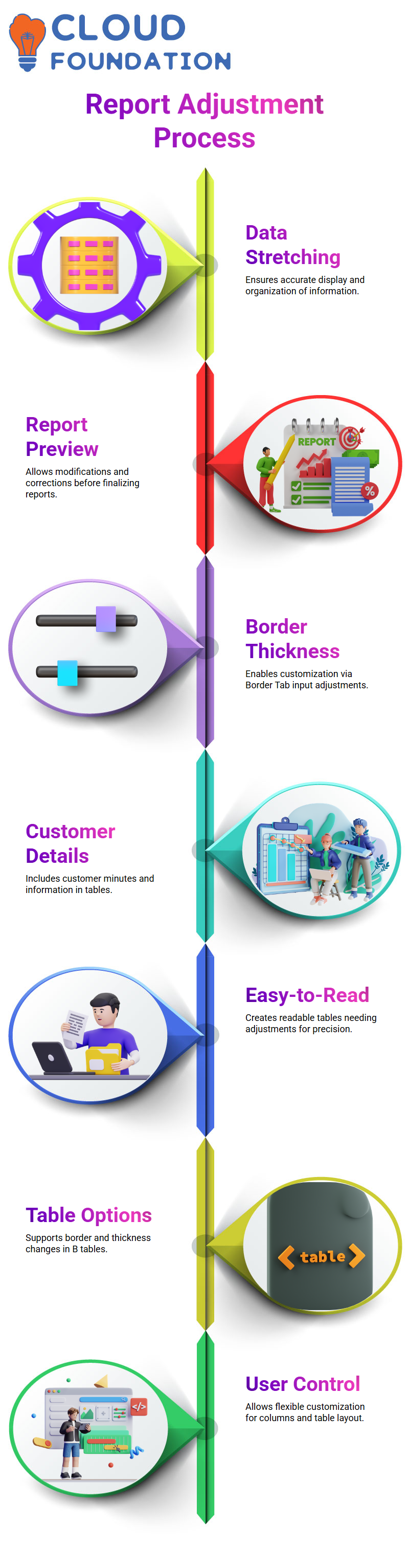
Users looking to preview their report can do so by going to the preview tab and entering desired values for data sources and sets in order to gain a preview of it and make any needed modifications or corrections to them.
This allows them to gain a true representation of how it looks before adjusting any required items on it.
The Preview Tab displays a table with its borders completely filled. Users may adjust its thickness by typing directly into the Border Tab.
Thickening has slightly changed; however, not significantly so. Now included in the report are details about each customer’s minutes as well as all customer information.
User enters customer details into a report, creating what looks to be an easy-to-read report but that still needs some adjustments made to its tables.
Users select B tables before navigating to borders option in Border Tab to make adjustments on thickness of table by typing it directly in.
However, thickness has slightly changed while customer details have been added into table.
How to Add an Item to A Report Using Microsoft Design Studio
At first, users will need to locate what they require within Solution Explorer reports folder by right-clicking and choosing “Add”. Alternatively, some may prefer the “New Report” button which launches an interactive wizard instead.
Next, choose your items from a list. When finished, create a report project by choosing either the most useful item or one with high frequency usage; change its name using “ctrl+”.
Once you’ve selected an item, click “Add” and then “Report.” From within this dialog box you can change its name by repeatedly pressing the ‘Add” key; doing so will create an entirely new blank report.
Step one to creating your report involves clicking on “Report,” selecting “Basics,” and finally clicking on “Add.” This will create a blank report in the center of your screen.
At first, this process may seem cumbersome and long, but with practice you will soon produce reports which are both visually attractive and user friendly.
To quickly add items to a report items list, the fastest and simplest method is double-clicking anywhere on the screen to add that item.
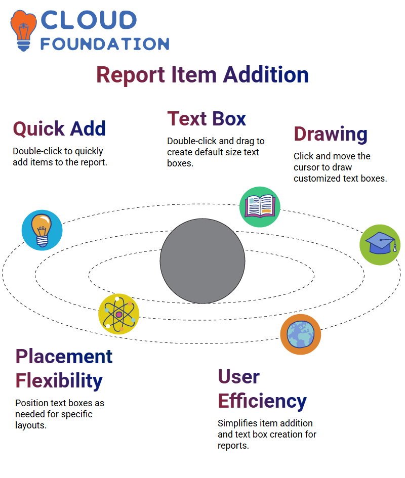
For creating default size text boxes quickly and efficiently, double-click a text box, drag its corner over to its location on top left, double click again then dragged as usual into place on report pages.
Thirdly, an effective way of drawing text boxes is by clicking once on the text box tool and moving their mouse cursor around.
This approach enables users to draw a box that meets both desired size and placement specifications. On conclusion of all three techniques for drawing text boxes Click once on text box tool followed by moving mouse cursor
Conclusion
Whoever needs to turn data into understandable reports will find SQL Server Reporting Services (SSRS) an essential asset.
SSRS makes organizing and presenting data easily understandable – whether you’re tracking company performance, analyzing patterns or making choices.
SSRS supports enterprises’ efforts to make informed choices and enhance overall efficiency by connecting to various data sources, creating interactive reports, and disseminating these with others.
Effective and user-friendly tools exist that transform data into insights everyone can understand.

SSRS Course Price

Koppadi Madhavi
Author