Guidewire PolicyCenter Certification Training
Guidewire Policy Center Widgets Overview
The Guidewire Policy Center automatically provides widgets such as text input, text cell, add button, and delete button.
You may drag and drop these widgets as required in the detail view.
Using the Guidewire Policy Center widgets appropriately guarantees a seamless experience for developers and users, regardless of whether you are developing forms or data-entry interfaces.
Guidewire Policy Center Working with Widgets
I begin to investigate PCFs and widgets inside the Guidewire Policy Center. List view, detail view, card screens, and container widgets are my main areas of interest.
Because they bundle atomic widgets together, container widgets are particularly helpful for managing many items in the Guidewire Policy Center.
I initially set areas aside so I may concentrate on the widgets.
To operate effectively in the Guidewire Policy Center, you must know how to utilize input sets, screens, and container widgets.
Guidewire Policy Center Labeling Widgets
The establishment of the detail view is the first item to comprehend in the Guidewire Policy Center.
The necessary variables are added first. The Guidewire Policy Center’s required variables make sure that every widget is appropriately connected to its data source.
In order to keep your widgets consistent across the Guidewire Policy Center and to arrange them properly, you then add input columns to the detail view.
Once you know how to do it, labeling widgets in the Guidewire Policy Center is simple.
Connect the label element to the appropriate data item by dragging it into the input column.
A simple and consistent user interface layout is produced in the Guidewire Policy Center by placing the label on the left and the value on the right.
Make sure the data type corresponds to the input element when adding user input fields, such text or date input, to the Guidewire Policy Center.
For instance, date fields need to connect with date values, and text fields ought to link with string values.
The Guidewire Policy Center’s meticulous attention to detail guarantees that every input works as intended.
Best Practices for Widgets in Guidewire Policy Center
Never forget that each input column and detail view in Guidewire Policy Center has a certain structure.
The input column should be added first, followed by atomic widgets or inputs. To guarantee clarity, be sure to apply display labels using display keys.
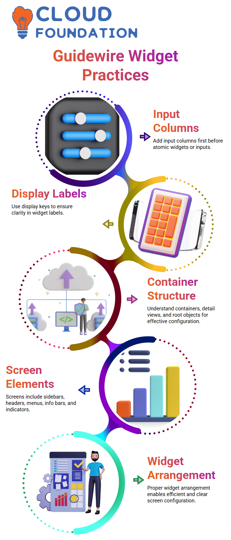
You can configure screens in Guidewire Policy Center more effectively if you know the structure of containers, detail views, input columns, and root objects.
You can easily create intricate interfaces without losing track of any widgets once you get the hang of it.
Understanding Container Widgets in Guidewire Policy Center
The screen is the top container that we use in Guidewire Policy Center. Detail views, list views, card views, and input sets may all be embedded underneath the screen.
I’ll just be talking about widgets today, not places. Knowing how widgets are arranged in Guidewire Policy Center facilitates efficient screen configuration.
A sidebar, headers, menu items, info bars, and location indications are among the several parts that appear when you launch a screen in Guidewire Policy Center.
Since container widgets are the foundation of Guidewire Policy Center’s user interface, we limit our attention to them for this purpose.

Guidewire Training
Guidewire Policy Center Widgets and Containers
I begin my work in Guidewire Policy Center by locating buttons, cells, and inputs. All of these components are compatible with container widgets, such as list views and detail views.
Guidewire Policy Center shows data accurately and consistently because to this structure.
I often verify that the root object is allocated appropriately for each container widget in Guidewire Policy Center.
For instance, in order for Guidewire Policy Center to display the user interface (UI) adequately, interaction extensions or summary objects need to be correctly connected.
Guidewire Policy Center: Understanding Detail View and Input Sets
The detail view serves as the main level container widget in the Guidewire Policy Center.
Consider it the base upon which other elements are built. Since the hierarchy only permits top-level widgets here, secondary container widgets cannot be placed directly in it.
Working with the Guidewire Policy Center becomes lot easier if you comprehend its framework.
An essential component of the Guidewire Policy Center is input sets.
They make it possible to aggregate atomic widgets, which is particularly helpful when conditions are shared by many fields.
For instance, an input set may include tax-related fields such as Tax ID, Tax Resume, or Tax Percentage.
You apply the criteria once to the input set rather than writing them for every field. This guarantees that fields effectively adhere to the same visibility or editability criteria.
Managing Locations and Input Sets in Guidewire Policy Center
Once the fundamental widgets are understood, location groups, pages, wizards, and worksheets become simpler to manage.
I also make new input sets and displays. This enables me to adapt the Guidewire Policy Center process to the requirements of my project.
I feel secure managing any Guidewire Policy Center project since I have practiced these processes several times.
Applying Conditions in Input Sets of Guidewire Policy Center
An editable property is present in input sets while working in the Guidewire Policy Center.
Your condition is applied to every field in the input set when it is written here. The condition is applied consistently regardless of the number of fields included.
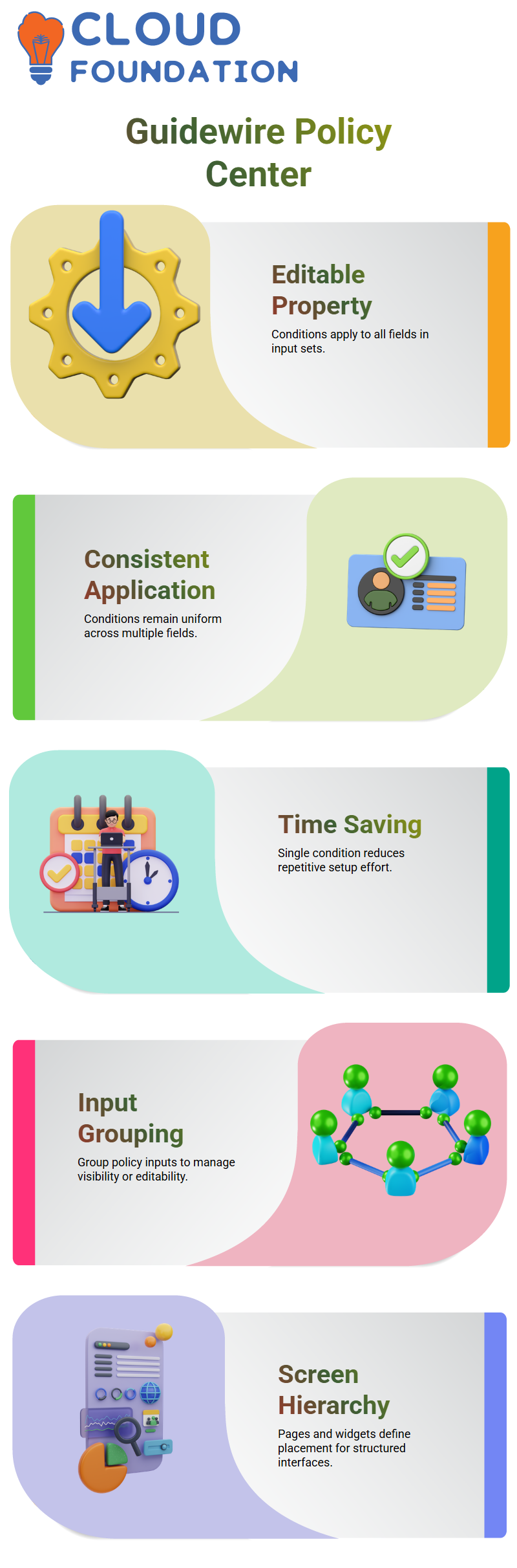
This method keeps your setup tidy and saves time. You may group all of your policy-related inputs, such as the start date, into an input set and use a single condition to restrict visibility or editability.
This removes tedious effort and guarantees uniformity throughout your Guidewire Policy Center displays.
Screen Hierarchy and Placement in Guidewire Policy Center
Only pages and widgets are permitted to have screens in the Guidewire Policy Center. There can only be one screen on a page at once.
The technology indicates suitable locations as you drag and drop displays, assisting you in positioning them appropriately.
Building efficient and well-structured interfaces in the Guidewire Policy Center requires an understanding of this hierarchy.

Guidewire Online Training
Locations in Guidewire Policy Center
Locations are crucial to the Guidewire Policy Center’s page structure. Each page in a location group may include a screen with nested widgets like as input sets, cards, list views, and detail views.
Building scalable interfaces is made easier with an understanding of this structure.
Another essential component of the Guidewire Policy Center is wizards. An organized set of screens that runs one after the other is called a wizard.
When you create a policy, for example, the wizard walks you through the coverage, location, car, driver, and policy details panels.
The user experience is enhanced and data consistency is guaranteed by this well-organized flow.
Using Pop-Ups in Guidewire Policy Center
Clicking on a button or link in the Guidewire Policy Center causes pop-ups to display.
They provide access to the old screen while momentarily opening a new one.
Pop-ups are useful for brief exchanges without diverting attention from the primary task.
Guidewire Policy Center Pages and Locations
Guidewire Policy Center pages are regarded as places. To make sure the right PCF components are there, I always go over each page.
This involves checking the top-level containers, widgets, and detail views in Guidewire Policy Center for correct organization.
Working efficiently with Guidewire Policy Center requires an understanding of the connections between pages, detail views, and widgets.
Before making any changes, I always make it a point to look at every PCF element on a site.
Creating Screens and Containers in Guidewire Policy Center
When you get a requirement in Guidewire Policy Center, you must first build a new screen. Containers are added to the screen once it has been created.
Prior to adding the screen container and detail views or card views, I always begin by creating the PCF file for the screen.
For instance, you put your widgets in the canvas section of Guidewire Policy Center.
The primary file is shown by white regions, referenced files are shown by light blue, and nested references are shown by dark blue.
Managing many files and container connections in Guidewire Policy Center is made simpler by paying attention to these color codes.
Detail Views and Root Objects in Guidewire Policy Center
Information from root objects—typically entities like Account or Contact—is shown in detail views in Guidewire Policy Center.
You may find root objects in Guidewire Policy Center by looking through the needed variables and detail view variables sections.
For example, the AccountContactDetailView in Guidewire Policy Center utilizes the Account and Contact entities as root objects.
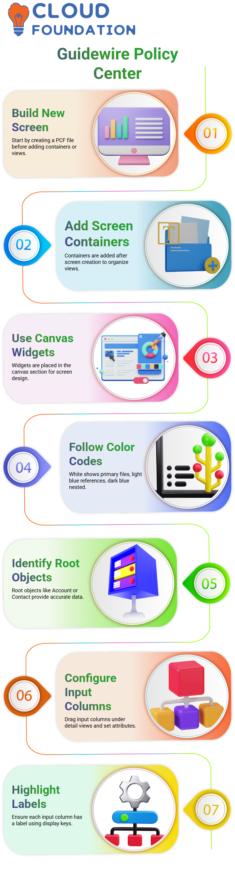
Guidewire Policy Center can get and provide accurate data in the user interface thanks to this configuration.
In order to manage screens and widgets in Guidewire Policy Center effectively, it is essential to comprehend root objects.
Configuring Input Columns in Guidewire Policy Center
In Guidewire Policy Center, atomic inputs or widgets are housed in input columns.
You may drag and drop an input column from the toolbox and position it underneath the detail view to set it.
You may configure attributes, such as labels or display keys, for each input column in Guidewire Policy Center.
In Guidewire Policy Center, I always make sure that at least one label is highlighted in each input column.
By utilizing the appropriate display key and consulting the display.properties file, you may set this label.
This procedure makes it simple to maintain in Guidewire Policy Center and guarantees uniformity across displays.

Guidewire Course Price

Vanitha
Author
The capacity to learn is a gift; the ability to learn is a skill; the willingness to learn is a choice