Workday Reporting Online Course
YTD Earnings in Workday Reporting
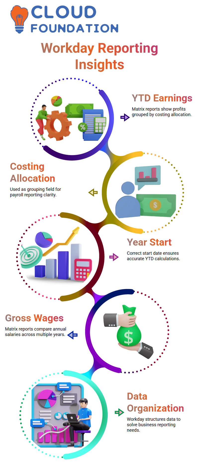
I usually begin my Workday Reporting classes with real-world payroll examples. Allow me to explain a typical need: year-to-date profits by costing allocation.
I know right away that I need a matrix report in Workday Reporting if I want to display profits grouped by costing allocation.
Costing allocation becomes my group by field in this situation. I then calculate the YTD earnings.
However, I want to make one thing clear before I construct anything in Workday Reporting: what does YTD imply in this context? Does January 1st mark the beginning of the year?
Does it adhere to the fiscal year? Or does it begin with the first period of payroll? Before designing the Workday Reporting logic, I always make sure the year start date is correct.
I stress that definitions inform design when I teach Learners about Workday Reporting.
My YTD figure in Workday Reporting has to take into account the fact that the fiscal year begins in April.
January 1st becomes my beginning point if it’s a calendar year. Workday Reporting’s report structure will never be correct without this clarity.
Yearly Gross Wages Structure in Workday Reporting
Annual gross salaries are another example that I often bring up in Workday Reporting training.
Let’s say I have to show gross salaries by year, such as 2023, 2022, 2019, and so on.
I once again utilise a matrix report in Workday Reporting if I want to display the amount side by side by year.
I carefully arrange the rows and columns in Workday Reporting.
For instance, I may put Gross Wages as a value field and Year as a collection of columns.
Management may compare figures across years easily in this format.
When I correctly create Workday Reporting, that is its power.
Workday Reporting is more than simply gathering data, as I often explain to my Learners. It involves organising data to provide clear solutions to business issues.
Types of Reports Available in Workday Reporting
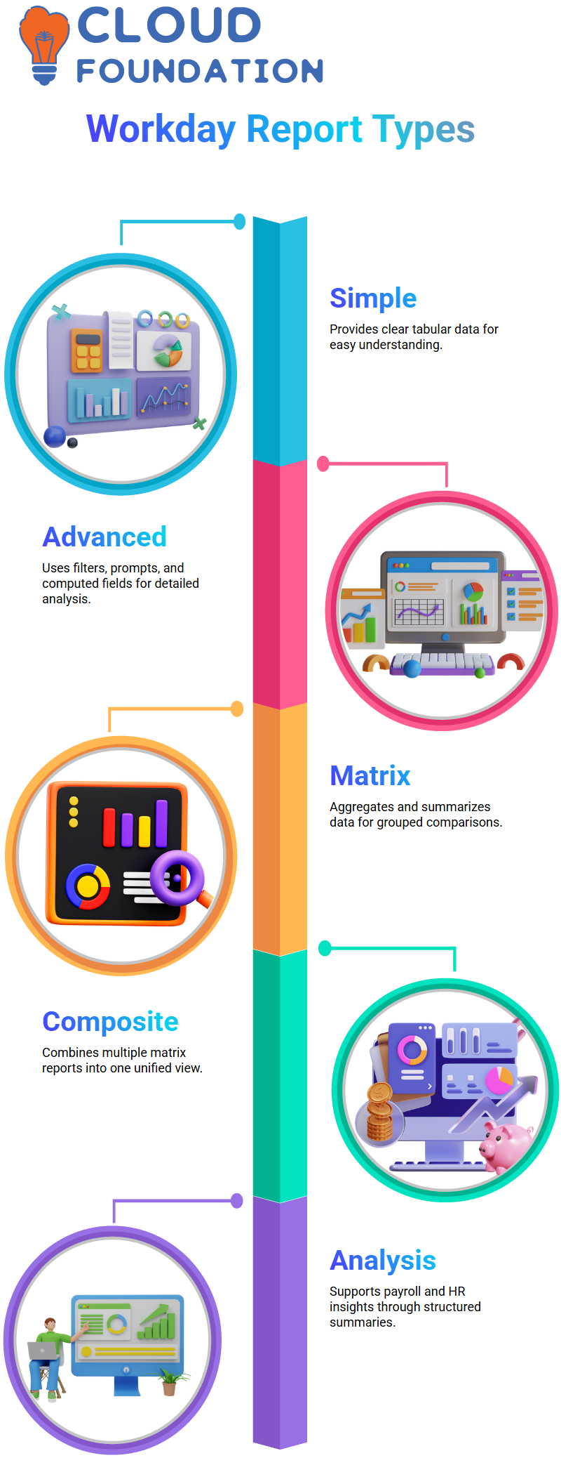
When someone inquires about the sorts of reports available in Workday Reporting, I explain that there are four primary categories: Simple, Advanced, Matrix, and Composite reports.
A basic report in Workday Reporting provides clear tabular data.
I may use filters, prompts, and computed fields in an advanced report.
I can aggregate and summarise data in a matrix report. Additionally, a composite report merges many matrix reports into a single display.
Since learning these four categories is the cornerstone of having good Workday Reporting abilities, I make sure my Learners fully comprehend them.
How Matrix Reports Work in Workday Reporting
I’ll use a real-world scenario to illustrate matrix reporting in Workday Reporting. Let’s say I want to see the statistics for 2019.
In 2019, I would want to see the gender distribution, the average wage by nation, and the number of employees per country.
I make this aggregation and grouping inside a matrix report in Workday Reporting.
I can aggregate data, such as country, and then compute figures, like headcount or average salary, Workday Reporting’s matrix reports.
Workday Reporting is very helpful for payroll and HR analysis because of its bundled summary.
Since most business needs include grouping, totals, or comparisons, I utilise matrix reports in Workday Reporting quite a bit.

Workday Reporting Training
What Is a Composite Report in Workday Reporting
Let me now provide a brief explanation of composite reports in Workday Reporting. Multiple matrix reports are combined to create a composite report.
In Workday Reporting, I use a composite report when I generate many matrix reports and then combine them into a single view.
For instance, let’s say I want to display country-specific education information from the Education business object and country-specific headcount from the Worker data source.
I am unable to manually merge two unconnected business items into a single matrix report in Workday Reporting.
A composite report might be helpful in this situation.
I thus created distinct matrix reports in Workday Reporting first, then merged them into a composite report.
This enables me to provide many data viewpoints in a unified, organised result.
Business Objects and Data Sources in Workday Reporting
I usually make sure to explain the distinction between business objects and data sources when I teach Workday Reporting.
To put it simply, I consider a business object to be a more comprehensive structure that contains linked data. I have data sources within that structure.
A business object is comparable to a schema, and a data source is comparable to a table, if I were to relate this to database concepts when describing Workday Reporting.
For instance, in Workday Reporting, a worker is a business item. I may utilise a variety of data sources in Worker for HCM reporting.
Since choosing the appropriate data source from the appropriate business object is the first step in creating any custom report, knowing business objects is essential to Workday Reporting.
Related Business Objects in Workday Reporting
I also deal with relevant business items in Workday Reporting. Let me give you an example of a database.
In previous systems, I had to combine the Employee and management tables if I needed management and employee information in a single report.
I use connections between business items in Workday Reporting rather than manually building joins.
The Related Business Objects tab appears when I view Business Object Details in Workday Reporting.
In Workday Reporting, these connections take the role of conventional joins. In order to include fields from secondary items in my report, I go through linked business objects.
When to Use Prism in Workday Reporting
I sometimes encounter a scenario in Workday Reporting when two business items are unrelated.
I can’t use regular custom reports to get the combined data from both if my customer still needs it.
In these situations, I use Prism Analytics as an add-on feature for Workday Reporting.
With Prism, I can import external data and carry out sophisticated computations, unions, and joins as with conventional database systems.
I consider Prism to be Workday Reporting’s more sophisticated layer.
When standard connections are insufficient, Prism provides me with the adaptability to appropriately model and integrate data.
Dashboards Alongside Workday Reporting
I often use dashboards in Workday Reporting in addition to composite reports. A dashboard functions similarly to a layer of displays.
I may display many custom reports on a single screen by adding them to a single dashboard.
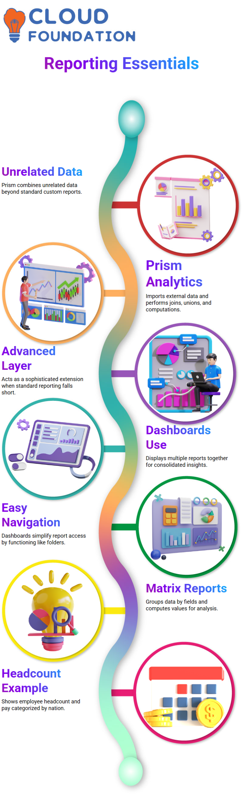
Dashboards allow management users to examine various insights in one location, which increases the value of Workday Reporting.
Workday Reporting opens a report with comprehensive data, regardless of whether users click on any report inside the dashboard.
In Workday Reporting, I often refer to a dashboard as a folder containing many reports. For business users, it facilitates navigation and easily arranges information.

Workday Reporting Online Training
Matrix Reports in Workday Reporting
Since matrix reports are the cornerstone of intelligent reporting, I begin my Workday Reporting classes by going over the fundamentals of these reports.
Simply put, a matrix report in Workday Reporting is one in which I arrange data according to a certain field and then provide computed values against that grouping.
For instance, I often provide a headcount report by nation.
I can quickly view the headcount for each site and categorise employees by nation in Workday Reporting.
To display the total pay paid in each nation, I may also include an additional column. That is Workday Reporting’s strength.
Building Composite Reports in Workday Reporting
I may merge many reports into a single structured view in Workday Reporting by creating a composite report.
When I require various groupings in Workday Reporting, I create two distinct matrix reports: one for the headcount by nation and another for the headcount by continent.
Each matrix report is added to distinct rows within the same layout when I utilise Workday Reporting to generate the composite report.
I may put disparate datasets together without imposing a direct link between them because of Workday Reporting’s flexibility.
Limits and Structure in Workday Reporting
I am often asked by Learners whether Workday Reporting restricts the quantity of reports that may be included in a composite report.
I have successfully merged eight to ten reports into a single composite in my Workday Reporting experience.
I describe the structure in detail when I contrast this with Workday Reporting’s dashboard constraints.
With six tabs and six reports each tab, a dashboard may display 36 thumbnail reports simultaneously.
Workday Reporting remains strong despite these structural limitations.
Workday Reporting Effectively in Dashboards
I’m concentrating on dashboard information presentation as I continue to work with Workday Reporting.
My control over what shows up as thumbnails and in the ‘other reports’ area is provided by Workday Reporting.
Workday Reporting gives me the ability to arrange data in a manner that makes sense for the company, whether I’m creating a composite report or a matrix report.
I urge you to create headcount examples by nation and continent to practice Workday Reporting every day.

Workday Reporting Course Price

Vanitha
Author
The capacity to learn is a gift; the ability to learn is a skill; the willingness to learn is a choice