Data Visualization Tutorial
Introduction to Data Visualization
In this day and age of digital technology, data visualization is an essential tool because it facilitates the ability to comprehend information more easily. In other words, it is a graphical representation of data that may be utilized to convey information in a more straightforward manner, hence making it simpler for customers to comprehend.
Not only does data visualization involve the creation of a complicated spreadsheet or PowerPoint presentation, but it also involves the creation of graphics that illustrate information in a more straightforward manner.
Through this, viewers are able to easily locate the information they are seeking for without having to sift through the content
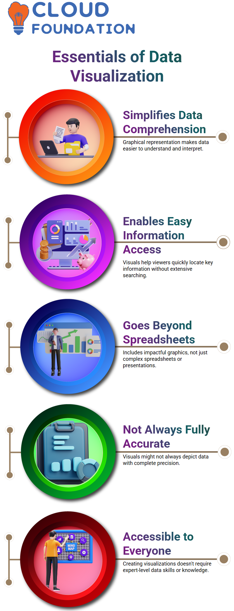
In order to display all of the data, the data visualization tool is utilized; nevertheless, it is essential to keep in mind that this approach might not always be the most accurate depiction of the data
To deliver information in a manner that is simple and straightforward for customers to comprehend is of the utmost importance. Anyone, regardless of their line of work, is capable of creating data visualizations; it is not required to be a data genius in order to undertake this task.
Use of Data visualization
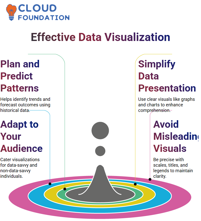
For the purpose of planning schedules, identifying relationships, communicating changes across time, and forecasting future outcomes, it will be utilized. If time is one of the factors in your data, a graphic can assist in the communication of changes by bringing to light patterns that have occurred in the past.
Visualization can also assist in the prediction of future outcomes by identifying patterns that have occurred in the past. The frequency of visualization is correlated with the accuracy of predictions, and it is essential to have the ability to efficiently assemble and analyze data.
Graphs and charts are examples of the types of formats that can be used to display information in order to facilitate better understanding and communication of data. Nevertheless, it is not always the ideal answer, and the best practices rely on the kind of data you are working with as well as the audience you are conducting your research with.
Follow the below points to get the most out of your data and extract the most value possible:
1. Ensure that your visualizations are kept straightforward and easy to understand by avoiding complexity and variables that are not necessary.
2. Ensure that you are catering to folks who are both data-savvy and non-data-savvy by knowing your target and including context in your communication.
3. Provide titles, axes, and legends that are easy to understand, and steer away of being deceptive or leaving anything up to the artistic interpretation of the audience.
4. Due to the fact that it is simple to mislead the audience, you should be deliberate about the scales that you employ.
5. In order to prevent misleading the audience, you should use caution while using titles, axes, legends, and footnotes.

Data Visualization Training
Role of Data visualisation in analysing and understanding information
The process of evaluating and comprehending huge amounts of information can be facilitated through the utilization of data visualizations. They are able to assist individuals in evaluating circumstances, determining whether or not it is required to take action, and processing various variables in a more effective manner.
Data visualizations such as pie charts, bar charts, and bar charts are among the most common types of data representations. Another popular option is the pie chart, which is straightforward and easy to comprehend. Bar charts are another popular alternative.
The ease with which pie charts can be used to show points and the changes in value between them has contributed to their widespread popularity. More examples of data visualizations that are simple to comprehend are bar charts and other similar representations. They are straightforward and can be applied to the analysis of data in a variety of guises.
This will be accomplished through the utilization of tools such as Visme, which provides templates that can be quickly modified to conform to your data. The data may be better understood with the assistance of these tools, which can also assist you in making judgments that are informed.
Many different types of data visualization tools are available on the website Visme.com. These tools include line charts, pyramid charts, stacked area charts, and radar maps. The purpose of line charts is to discover patterns and to exhibit variables in close proximity to one another.
Pyramid charts, on the other hand, are used to display visual hierarchy and can be used to emphasize the significance of revenue. Stacked area charts are a useful tool for identifying regions that could use improvement because they display changes over a range of values. In order to find areas in which one might improve in comparison to the competition, radar charts, which are also known as spyder or web charts, are utilized.
Essential Principles and Techniques for Effective Data Visualization
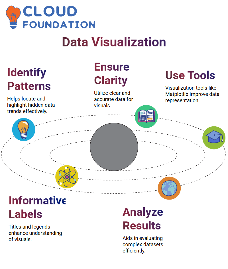
The process of data visualization entails locating previously hidden patterns within the data and ensuring that it is clear, accurate, and works effectively.
In order to visualize data, it is necessary to make certain that the data set is comprehensive and pertinent, and to make use of the new pattern that is derived from the data in appropriate locations. To effectively communicate the intended meaning, it is essential to make use of an appropriate pictorial depiction.
By utilizing effective visualization tools, all of the data points are brought to light. Data types and scale, informative interpretation, visual effect, coordinate system, and data kinds and scale are included among the fundamental aspects that should be taken into consideration.
Through the use of labels, title legends, and pointers, informative interpretation serves to facilitate the creation of visuals that are both effective and easily interpretable.
For the purpose of data visualization, Python programming languages can be utilized, and new libraries such as Matplotlib, Vispy, Boca, Seaborne, Pigel, Folum and Networks, and Matplotlib have emerged as the primary libraries for data visualization.
Researchers are able to evaluate results with huge and complex data with the assistance of these libraries, as well as generate visualizations that are both visually beautiful and useful.

Data Visualization Online Training
Considerations of Data visualization
Clearness, precision, and efficiency are the three most important factors to take into consideration while visualizing data. It is crucial to make sure that the data set is complete and relevant, and that the new pattern’s yield from the data is used in the appropriate locations. This will ensure that there is no confusion.
It is essential to make use of appropriate graphical representation in order to deliver the relevant message. Methods of data visualization that are effective highlight each and every data point.
For example, the visual effect, the coordination system, the data types and scale, the informative interpretation, and the utilization of appropriate shapes, colors, and sizes are all fundamental aspects that should be taken into consideration.
In order to better organize data points within the specified coordinates, the coordinate system is utilized. The selection of data kinds and size have to be based on the kind of data being collected, such as categorical or numerical data.
Through the use of labels, informative interpretation assists in the creation of visuals that are both effective and easy to interpret. It is also possible to convey the appropriate message through the use of title legends and points.
It is possible to visualize data through the use of Python programming, and recently, new libraries such as the Matplotlib library, Wispy Boca, Seaborne, Pixel Folium, and Networks have been introduced.
Data visualizations used by educators and medical professionals
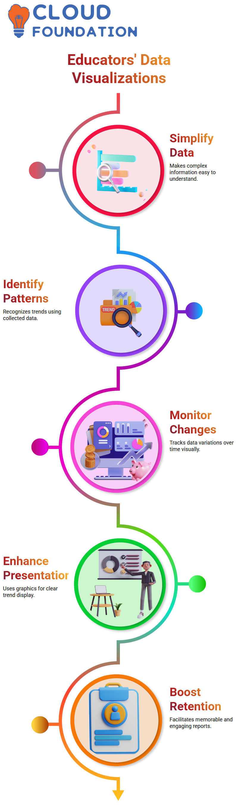
When it comes to creating meaningful data visualisations, educators and healthcare professionals can do so by concentrating on four different ways of presenting information.
The first reason is that it makes the data simple to comprehend since it enables the construction of a comprehensive report that can be read by the audience.
The ability to recognize patterns and trends on the basis of data collected over a period of time is the second factor.
The use of data visualisations can assist in the identification of patterns and trends, which in turn makes it simpler to display them in a form that is simple to comprehend.
Another reason is that it is possible to monitor data over a period of time and to visualize it through the use of graphics.
This enables the identification of trends and the presentation of those trends in an infographic manner to be made more straightforward.
The compilation of information over a lengthy period of time can also be facilitated by data visualizations, which can make the material more interesting and simpler to remember.
Use of a data visualisation tool to analyse data points
Alterations in data such as sales statistics, unemployment rates, and other variables can also be analyzed with the help of this application.
The data is displayed in two dimensions, which makes it simple to compute and compare the values as they are given.
After that, the data is organized in columns, which makes comparison significantly simpler. Following this, the data is presented in the form of a line chart, which makes it simple to compare the results of several years to one another.
It is possible to have a more in-depth comprehension of the data through the utilization of this instrument, which makes it ideal for comparing different years to one another.
The tool is particularly helpful for establishing several series and lines, which enables a more in-depth analysis of the data than would otherwise be possible.
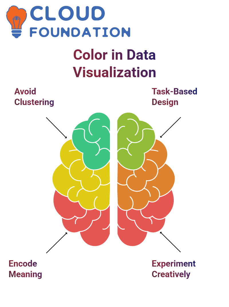
Colour usage in data visualization
The focus is on the potential problems that may arise when greens, pinks, and oranges are clustered together based on the original encoding.
Furthermore, it argues that a more effective method to employ color is to encode meaning with color, which would result in the addition of additional information that would not otherwise be there.
Last but not least, the book highlights that the most engaging visualization is not necessarily the greatest visualization. It is possible for data visualization to be more effective and instructive if it takes into account the tasks that users might be performing.
When it comes to data visualization assignments, new designers frequently want visualisations that are provocative, eye-catching, and interesting. These visualisations, on the other hand, might not necessarily be the most effective for the work at hand.
On the other hand, these representations may not perform well in certain jobs and may be difficult to extract precise information from. When beginning a career in data visualization, it is essential to exercise both creativity and experimentation with various methods of visualization.
It is vital to have a solid understanding of the coding process and the sizing of the bars in order to further develop a data visualization. The process of breaking things down and making bar charts that are more individualized can be helpful. This is something that can be accomplished by employing an intriguing stacking of bars to demonstrate whether or not the data is hitting the aim.

Data Visualization Course Price

Gayathri
Author